Designing and prototyping
A brand
From the beginning, the companion app wasn’t meant to be a brand so much as it already belonged to one--that of NA. To that end, I went straight to the best possible source on the design system: this article, penned by NA’s UI designer, Hisayoshi Kijima.
I also used my screen color picker to directly sample the game’s palette, eventually composing the palette below. I also decided to name the app “near,” referencing both NA’s title and the feelings I wanted players to experience relative to the game--closeness and familiarity.
The muted, drab brown paired well with the lighter beige to establish an easily readable high contrast theme. Accent colors emulated other dust-like shades. A bright green represented affirmative messages, and a duller red was used for negative tones, as it contrasted slightly better with the creamy background compared to the original red-orange in NA. Black, gray, and white were included for any edge cases, such as system messages.
UI elements such as the back arrow and icons in the Settings menu were taken from basic UI toolkits. Considering the competition, the benchmark for aesthetics wasn’t particularly high—the simplest shapes were the best ones. The real labor lay in the more specific buttons that pertained to menus from NA, such as Equipment or World. These would have to be matched with their in-game counterparts, or an icon as contextually appropriate as possible. I traced each icon against an overlaid screenshot from the game, using the “Outline Stroke” function to better resize the icon. Where a given icon was missing, such as for “Merchants” or “Fishing,” I drew the icon to match NA’s bold, angular strokes.
The typeface followed suit, with Inter being the almost immediate favorite due to its similarity to the font in NA. A lack of serifs and easy curves contributed to seamless readability, and the heavier fonts used for headers helped break up otherwise lengthy texts.

Default theme for near. I sampled various in-game screenshots of the menu in NA, then adjusted their levels for visibility. Instead of the orange used in NA, I opted for a deep, drab red that would better stand out against the beige background.

The "human" theme for near, or a rebadged version of the default iOS theme.

Component sheet for near. The need to create components first occurred to me once I realized copy-pasting the same button, then flipping its colors for each screen was incredibly time-consuming.

Inter, the typeface for near. I used different weights to help break up larger bodies of text.
Prototypes and addressing mistakes
The choice to stick to the source material as much as possible paid off. During the final usability tests, participants spoke appreciatively of the palette and iconography matching that of the game. They also noted the usefulness of the top carousel in browsing through the many categories of information the game had to offer.
However, the design’s old issues returned to haunt it. Some participants struggled with the lists of menus, often scrolling back and forth until they found what they needed. Though not practical for every menu, a carousel was implemented for the “Unit Data” page first, greatly improving the readability of the page and improving player retention in the browsing process. Further implementation in other menus is on hold for consideration.
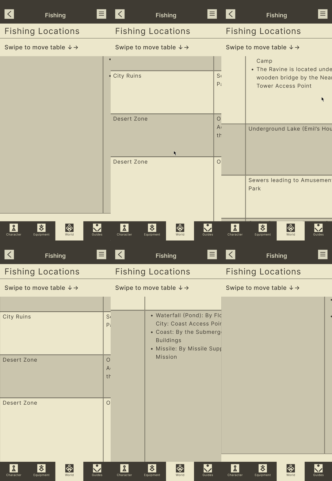
Another issue lay in how to present data entries with broader scopes. For example, NA, like other entertainment media, has its own online database, or wiki. Some entries can be complex enough to require tables for proper communication. However, these tables are chiefly meant to be viewed on desktop screens, where the wide aspect ratio can comfortably fit a table with numerous columns, some of them wider than others.
During the design phase, I considered how I could translate these tables into slightly more readable formats, and if possible, to shrink them. I weighed whether to copy each table as-is and make it scrollable, or break up the information into a “body paragraph” format.
Others struggled with the top menu carousel itself, citing a need for indicators lest they mistake the carousel for a lone label. This issue was particularly troublesome in the Character menu, where the carousel’s initial state made it look like a lone button instead. Indicators were later added as large “left” and “right” buttons stuck to either side of the carousel.
The font was also too big for most of the users, and was scaled down as a result.
Conclusion
near has succeeded in its purpose: to guide (in)experienced NA players through the game at their own pace. Information is thoughtfully organized, and the theme is a near 1:1 match of NA itself.
Designing near was a highly engaging learning experience in Figma and user-centered design. Though near itself seemed simple--especially relative to existing companion apps--the process behind it was not. During the design process, I learned:
To keep an open mind when surveying for research participants.
That copying a design to maintain familiarity doesn’t mean every aspect must be copied. Yes, the menus in NA are nested lists, but carousels are also possible--and more accessible.
Reiterate and generate new components as necessary (and quickly) to find what really works.


