Research and conceptualization
Problem
Role-Playing Games, (RPGs) like any other genre, contain their share of unique titles. Nier Automata (NA) is one such game, notorious for being designed specifically to thwart so-called “completionists” with its obscure lore, vague instructions, and several head-scratching achievements.
A companion app designed to assist NA players. A familiar layout and minimal design help the necessary information pop out so players can peek in for the tips they need and pop back into their game. A more robust host of features provides more than the game does and reduces time spent in a research rabbit hole.
Research
My problem could be divided into two:
What did other companion apps look like?
What do players usually complain about in their games?
Scouting out the competition
My initial understanding of the problem was informed by the numerous other companion apps I had used or tested out to better understand their patterns. I also knew from previous experience that wikis, or online fan-made publications, catered to players from all skill levels as libraries.
So as not to reinvent the wheel, my companion app would have to resemble these apps and sites and their layouts to some extent.
At the end of this research, several key features emerged:
An interactive map. Players appreciate being able to set waypoints on their app to inform their in-game travels.
Cover all the fundamental information. Whatever the game muddies should be crystal clear here.
Maintain flexibility by providing external links to highly specific sources of information, such as special weapon combos or game system breakdowns.
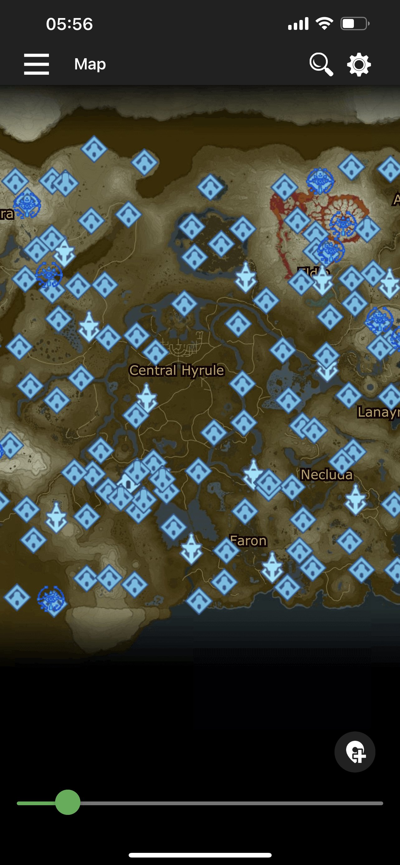
An interactive map in Breath Companion, a companion app for the game The Legend of Zelda: Breath of the Wild.

A list of menus in Breath Companion.

A summary of a given stage in Dead Cells, with each part of the stage communicated solely through game-specific icons.

u.gg, an online stat tracker for various online multiplayer games, such as League of Legends and Valorant.
Having conversations
To see the most prominent pain points players experienced during gameplay, I reached out to a few NA-centered online communities. Unfortunately, it took multiple weeks to recruit research participants because
Online forum users shy away not only from suspicious survey requests, but also from social contact in general.
Participants were not paid.
In hindsight, I should have surveyed RPG players in general. Given that NA is an RPG itself, even respondents who didn’t play NA could have given valuable insight. Still, the research was completed, and three major complaints emerged:
Onboarding is nearly nonexistent.
Information is difficult to access or is vaguely communicated.
Self-driven research is tedious and discourages most players.
These complaints were not exclusive to the inexperienced players, either--even veterans acknowledged their awkward beginnings and hours spent looking up obscure facts.
Synthesizing research
The thoughts and sentiments gathered during my research contributed to two user personas. Where were players coming from? How familiar were they with specific systems in games? What kept them going? Whether a player knew exactly what they were doing, how willing they were to accept help, or how much help they wanted were taken into consideration when deciding on appropriate features.
For example, a speedrunning timer and leaderboard were not included because such features cater to the top percentile(s) of a given gaming community. On the other hand, lore entries and specific progression strategies would cater to a wider audience.
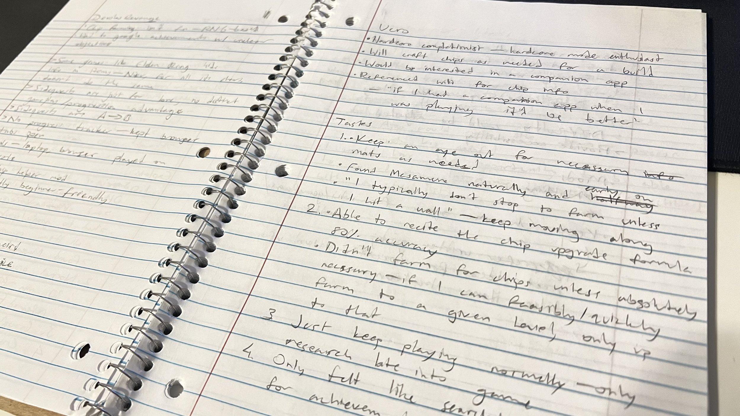
A spread of my notebook, where I jotted down what my research participants said in real time. This was a lifesaver for the first few interviews, as I'd forget to press the "record" button on my recording software at the start of an interview. To ensure accuracy, I often asked my participants to pause or repeat what they were saying, which they graciously obliged.
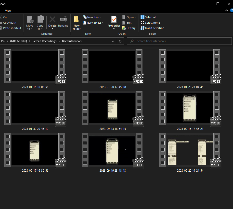
Later recordings. These interviews would go on for tens of minutes as participants expressed their sentiments in detail. Sometimes the conversation would follow some tangent about the game itself.
Sketching and wireframing
First Drafts
The lack of complex procedures and tasks allowed for a swift drafting process.
Whereas more common app types such as e-commerce or travel would include agendas or checkout screens, a companion app will not venture too far from its main purpose: providing actionable information in as few clicks as possible.
Wireframes and red routes sprung naturally to meet the direct nature of the jobs to be done, with little changing in the fundamental structure and presentation from iteration to iteration. The “information-first” directive kept routes as linear as possible, with crossovers only occurring when necessary.
Because information was sorted into list upon list of item, quest title, or enemy, the biggest problem to tackle was maintaining the player’s attention. Even the most resilient of attention spans can falter when scrolling past line upon line of text. However, due to competitors sticking to the “list of items” approach, the design was kept throughout the sketches and wireframes. The only carousels implemented were used to consolidate menus at the top of the screen instead of being hidden behind a hamburger button.
Preliminary tests echoed the concerns associated with the lists, but lauded the use of the top-mounted menu carousel and echoed its resemblance to NA’s own menus. It was decided from this point on that more thought be given to the presentation itself, with further iteration being saved for final polish to address issues brought up during prototype testing.
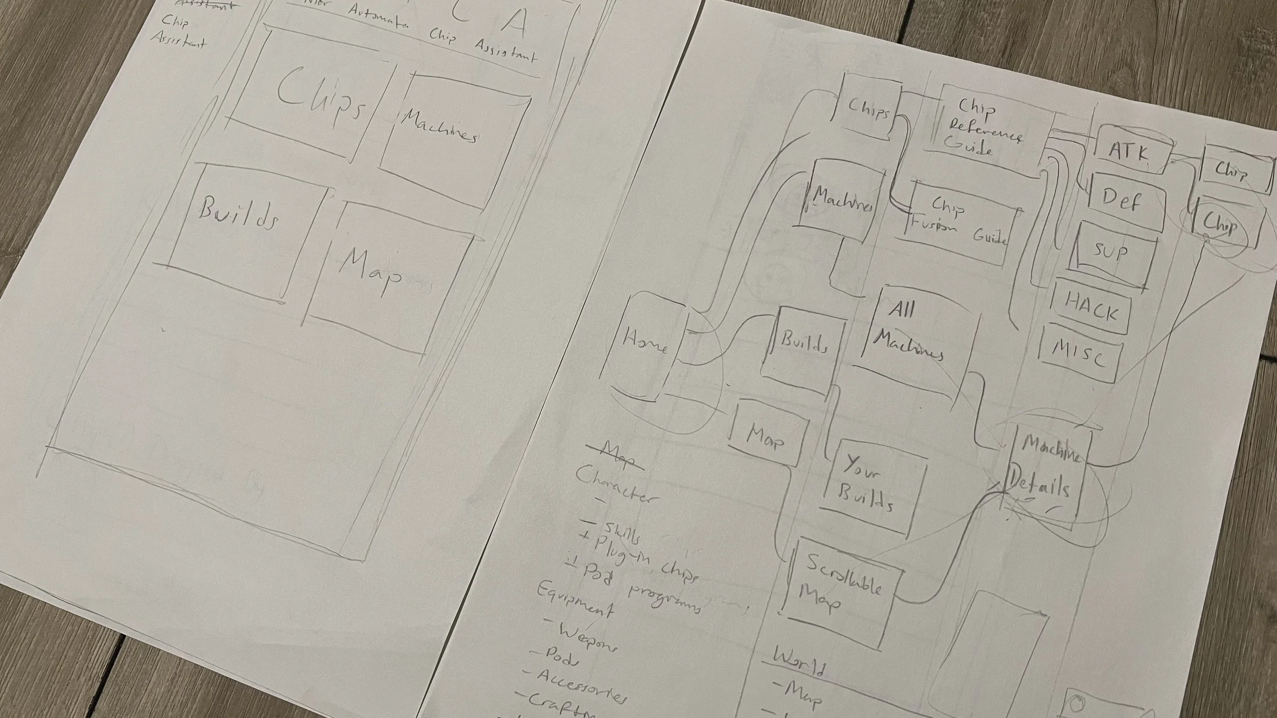
Left: The first iteration of the homepage, or "Speed Dial" screen. There was no menu bar at the bottom, and a persistent header dominated the top of the screen. Right: Early wireframe of the app mapping out possible menus, submenus, and interconnecting branches.
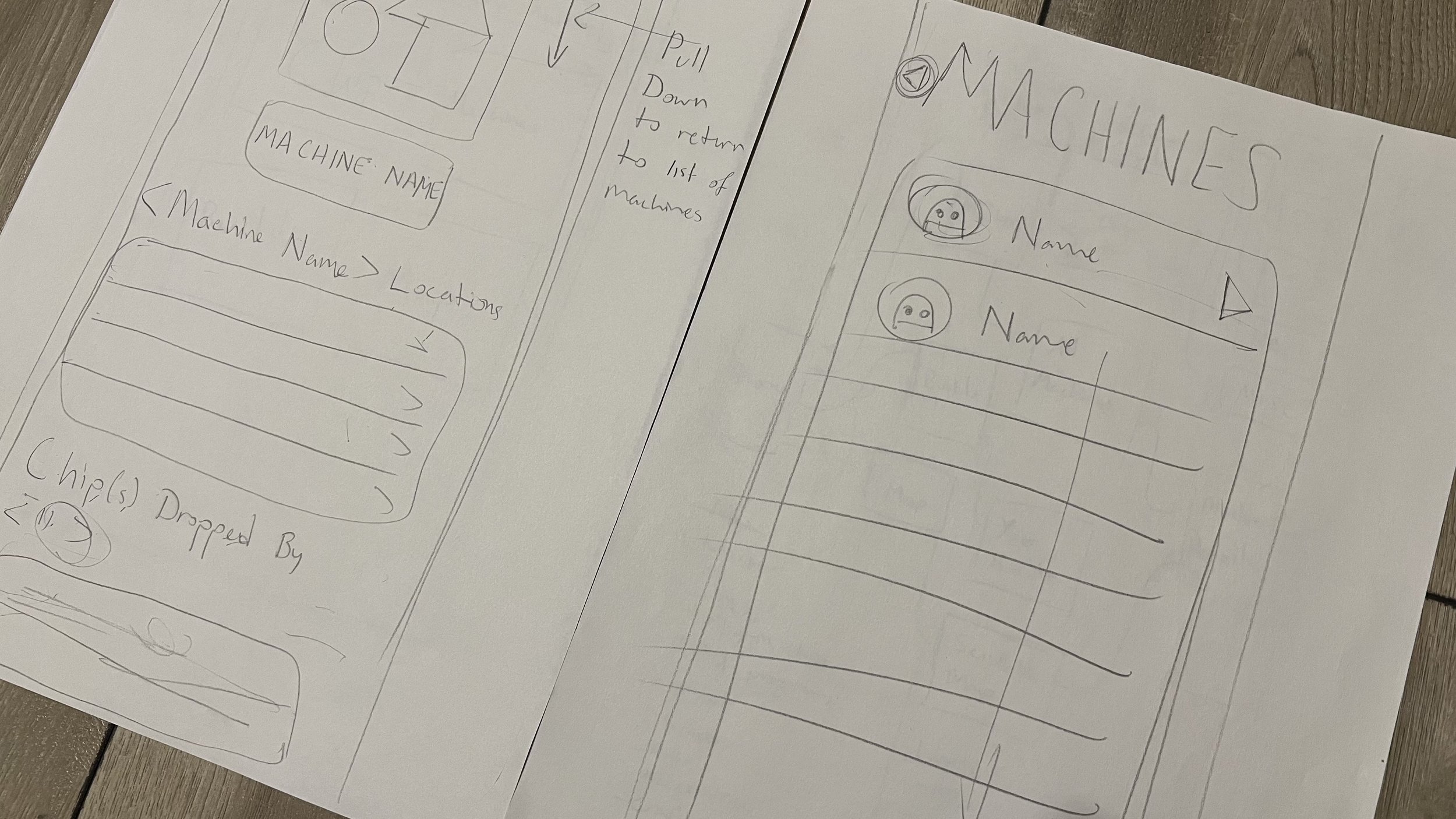
Left: Mockup of the machine data menu. I had not yet considered exactly how detailed I wanted the page to be, but I at least wanted locations and spoils to be displayed. Right: Simple list of machines. I was considering a list with profile pictures for each machine by its name.

Final wireframe draft. Relatively simple compared to most other app types, but comprehensive in its scope.
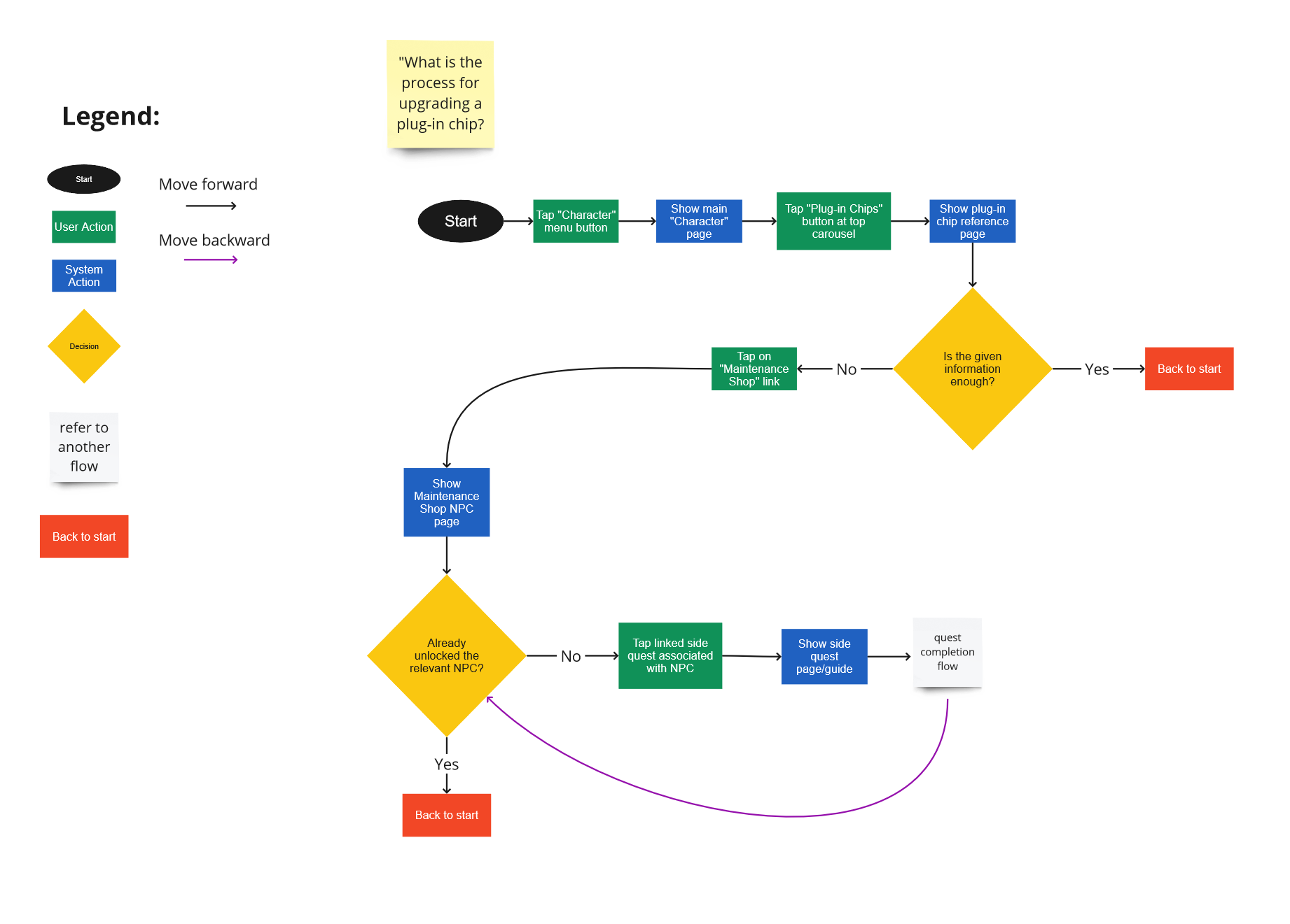
Draft of a user flow.
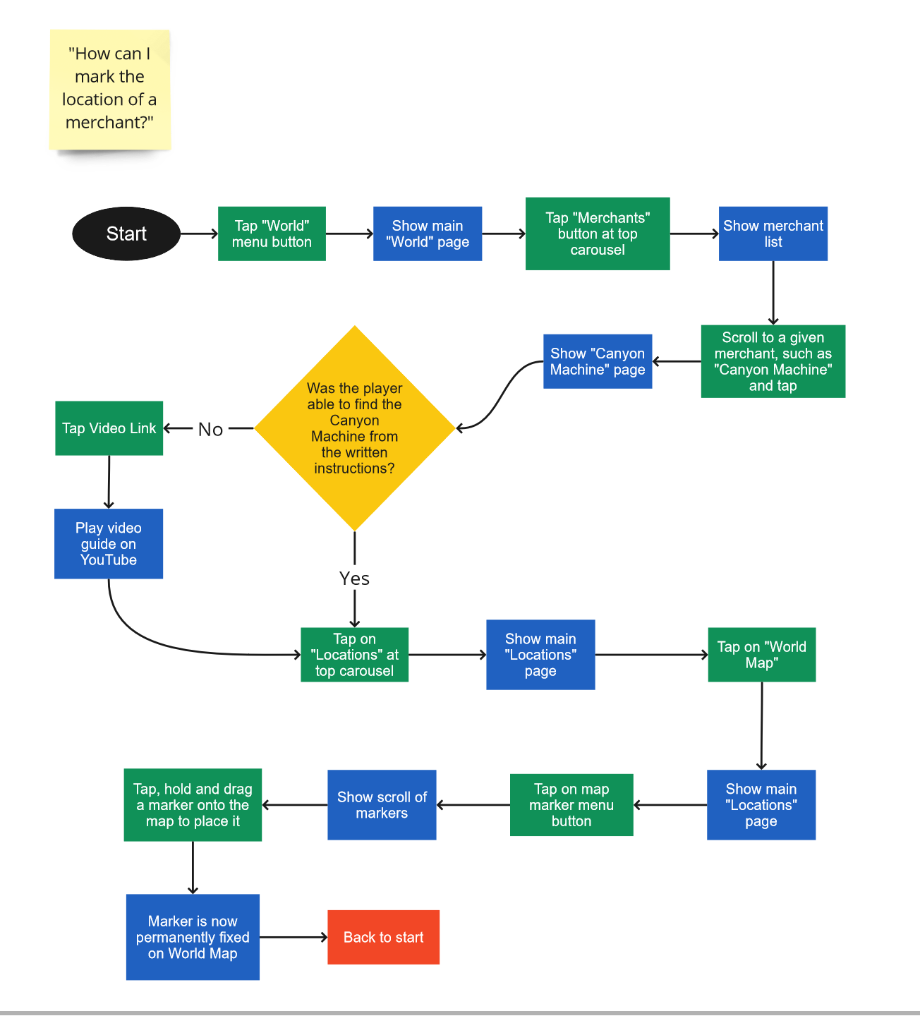
Another draft for a user flow.
